Logo investigation
Warner Bros
In 1925 The Warner Bros logo the letters expanded into a shield and the focus was then shifted to the words beneath them. The also incorporated the companies "The Vitaphone Corp." as this involved the production as found films and this was Warner Bros way of announcing that they were moving from silent to talking movies.
Five years later the Vitaphone emblem was removed and it started to look like how we see it today
In 1984, the corporation returned to its classic, time-tested design. It featured a shield with a ribbon against the blue sky and the spectacular golden abbreviation. The logo has gone through several decades without major redesigns.
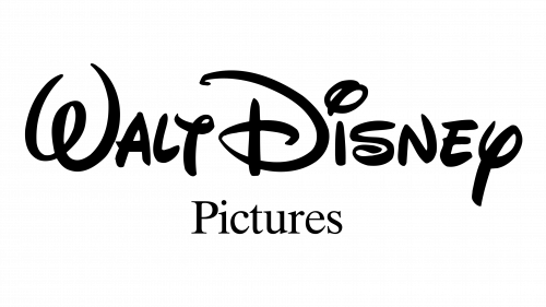
The original Walt Disney Pictures logo featured the name of the founder in a creative script. It remained quite legible in spite of its artistic design, though the only problem was probably the “t” in the word “Walt” – it could be interpreted as the “y.”
(1948-1979)The next logo was hardly good enough to use though it still looked quite stylish.
 In 1972 the designers returned to the style of the original logo. It was slightly updated, though, to make the wordmark was more legible. The word “Productions” in a simple sans serif type was added.
In 1983 while the lettering “Walt Disney” remained the same, the word “Productions” was replaced by “Pictures.”
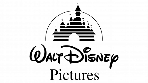
Cinderella’s castle made its debut on the 1985 emblem. It was placed above the lettering “Walt Disney,” which remained unchanged. The word “Pictures” stayed in the same font though it was now larger.
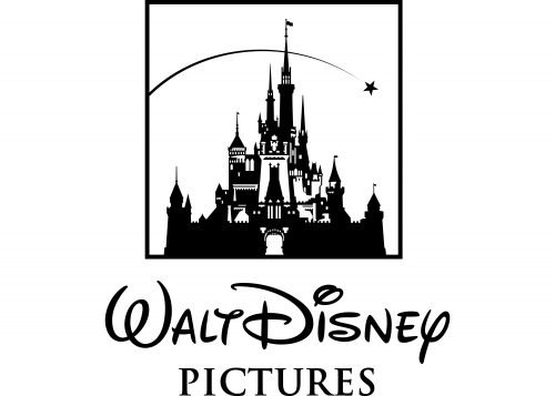
Eventually, Cinderella’s castle has become more detailed. With its towers and intricate rooms, it looks more appealing especially to color films. The text “Walt Disney Pictures” has grown smaller in comparison with the castle.
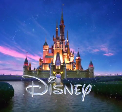
In 2011, they decided to get rid of everything written below the castle emblem, save for the single word ‘Disney’ as shown above. The Disney castle was created as a reflection of a magical castle. It was originally started as a from an actual castle but now is just a prototype of the Disney castle in Paris.
This is the logo nowadays.
Paramount Pictures
According to the founder of Paramount researchers it was based off the childhood of William Wadsworth Hodkinson- the founder of paramount. The 24 stars that form a circle over the mountain stand for 24 actors who signed their contracts with the film studio in 1914
On the new 1952 logo, the mountain grew higher and moved to the center of the composition. A blue sky with fluffy white clouds made the design feel vibrant and fresh.
In 1957, the Paramount branding took a turn towards minimalism. The logo was painted blue, and the landscape lost some of its details.
In 1987 it got revamped and the emblem was based off a painting. A picturesque lake appeared and the stars shined more.
In 2002, it was decided to add dynamics to the emblem. A new design displayed shooting stars over the the snowy mountain peak. The landscape turned out to be very romantic and dreamy.


Comments
Post a Comment